
Thrive a case study
Typography, Branding
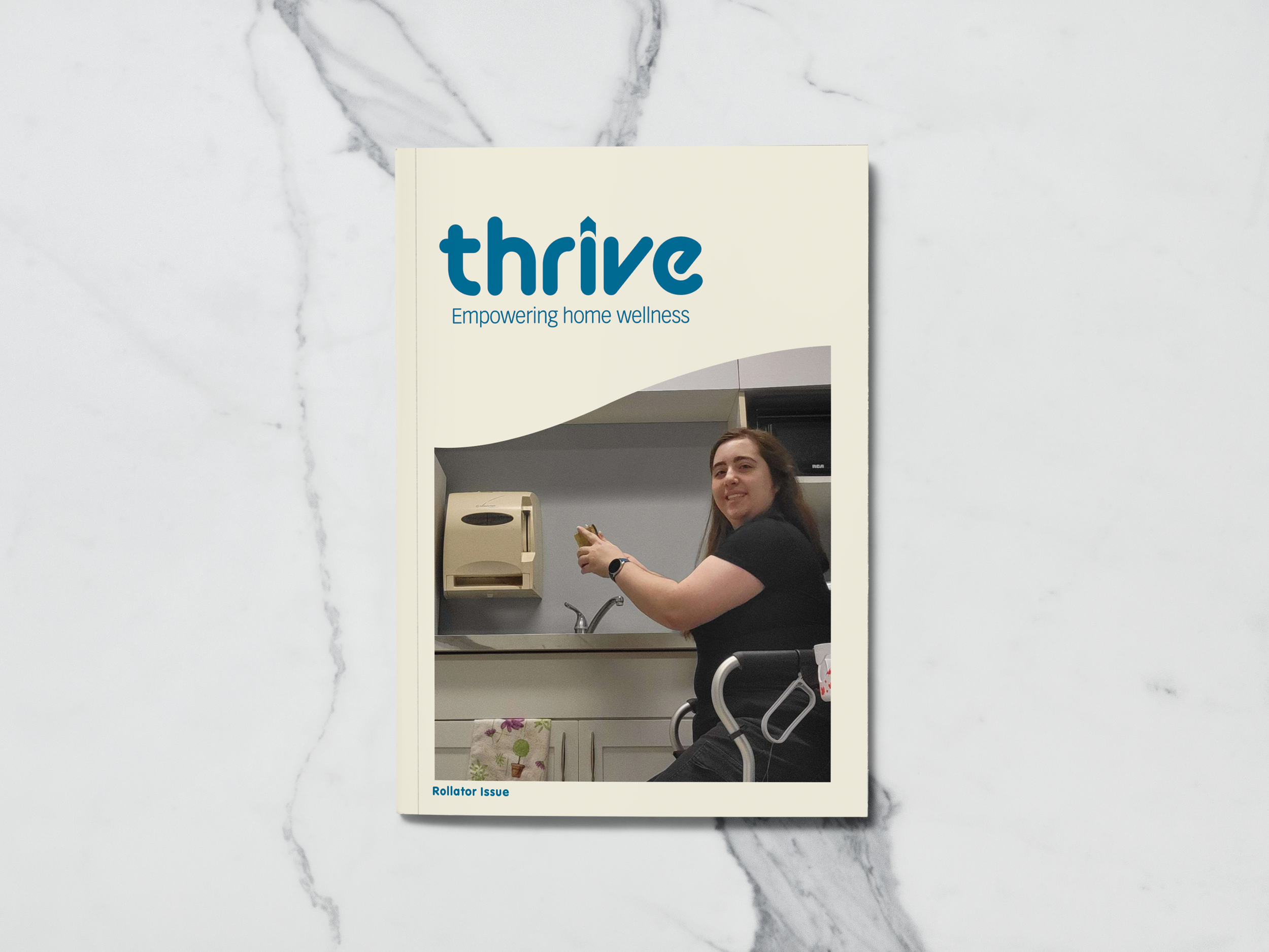
Thrive is a home healthcare company that empowers people to live their lives their way. Thrive creates informational booklets to help people learn about products and programs they may need. Their problem was that only retail home healthcare stores carried their booklets, meaning those who need the information but don’t know about these stores have no way to find Thrive’s booklets. They needed a better way to distribute the information in a way that would have a wider reach than they currently have.
Research
I have experience working at a home healthcare retail store, and a large number of people did not know we existed until they needed our service. There have also been times when a customer expressed that the doctors told them they needed to get something for a relative of theirs, but gave them no guidance on where to go to get said things. That is what Thrive is working against; they want information about home health care to be easily accessible for those who need it to help relieve the stress of trying to figure everything out on their own.
Competitors
Once a target audience was discovered, research into competitors had begun. During this research period, there was a realization
that most home healthcare magazines are about healthy eating, exercise, and mental health.
A home health care magazine focusing on products like walkers is difficult to find. ChatGPT would be the main competitor in that case,
People will use it when they do not know where to start and will follow it exactly, leading to the well-being of their loved ones worsening.
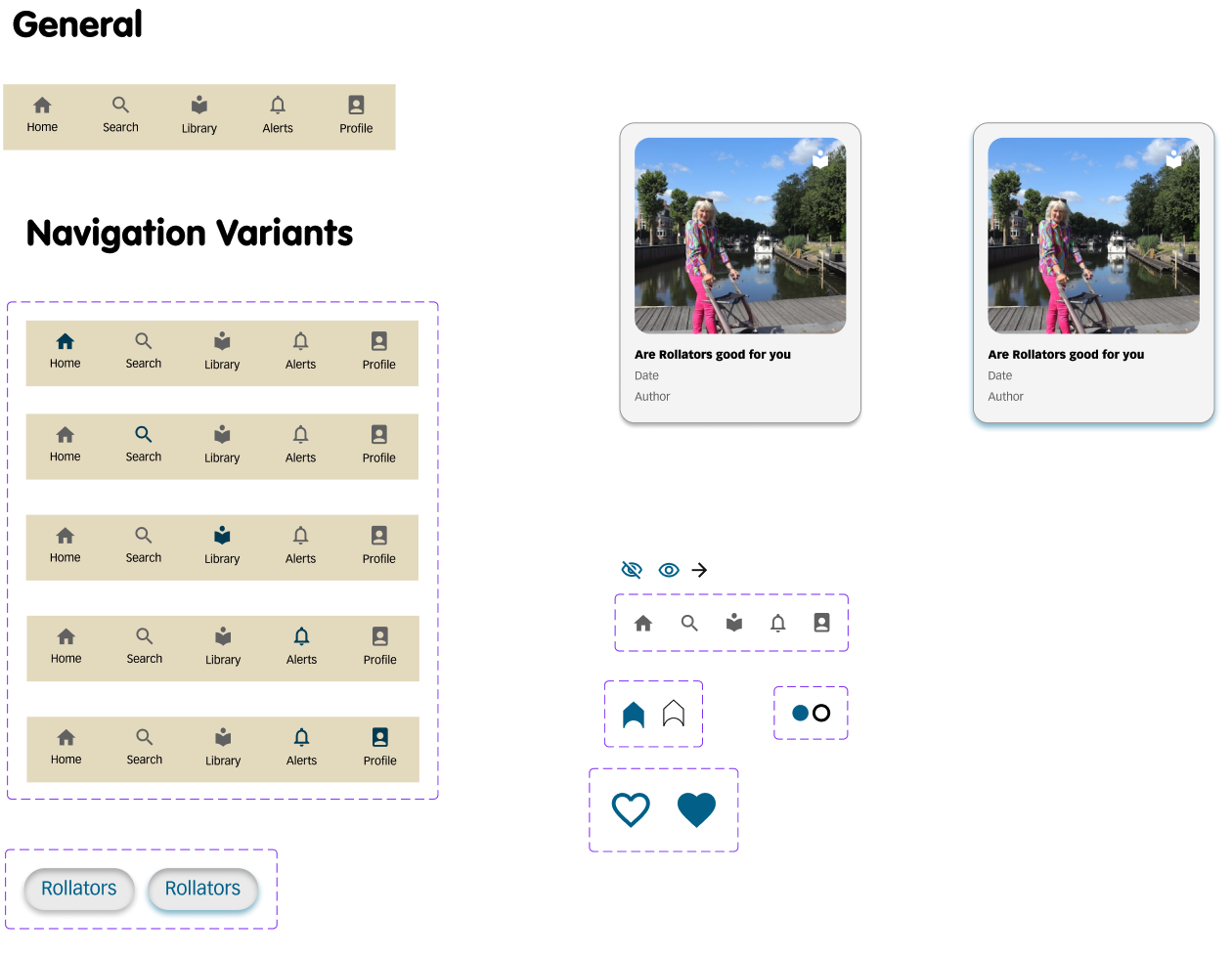
Brand Elements
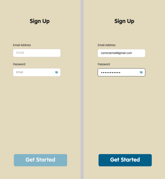
Using the colour scheme from the design, the components for the prototype were made. Navigation bars, buttons, fields for inputting email and password, a search bar, a loading logo, and a favourite function.
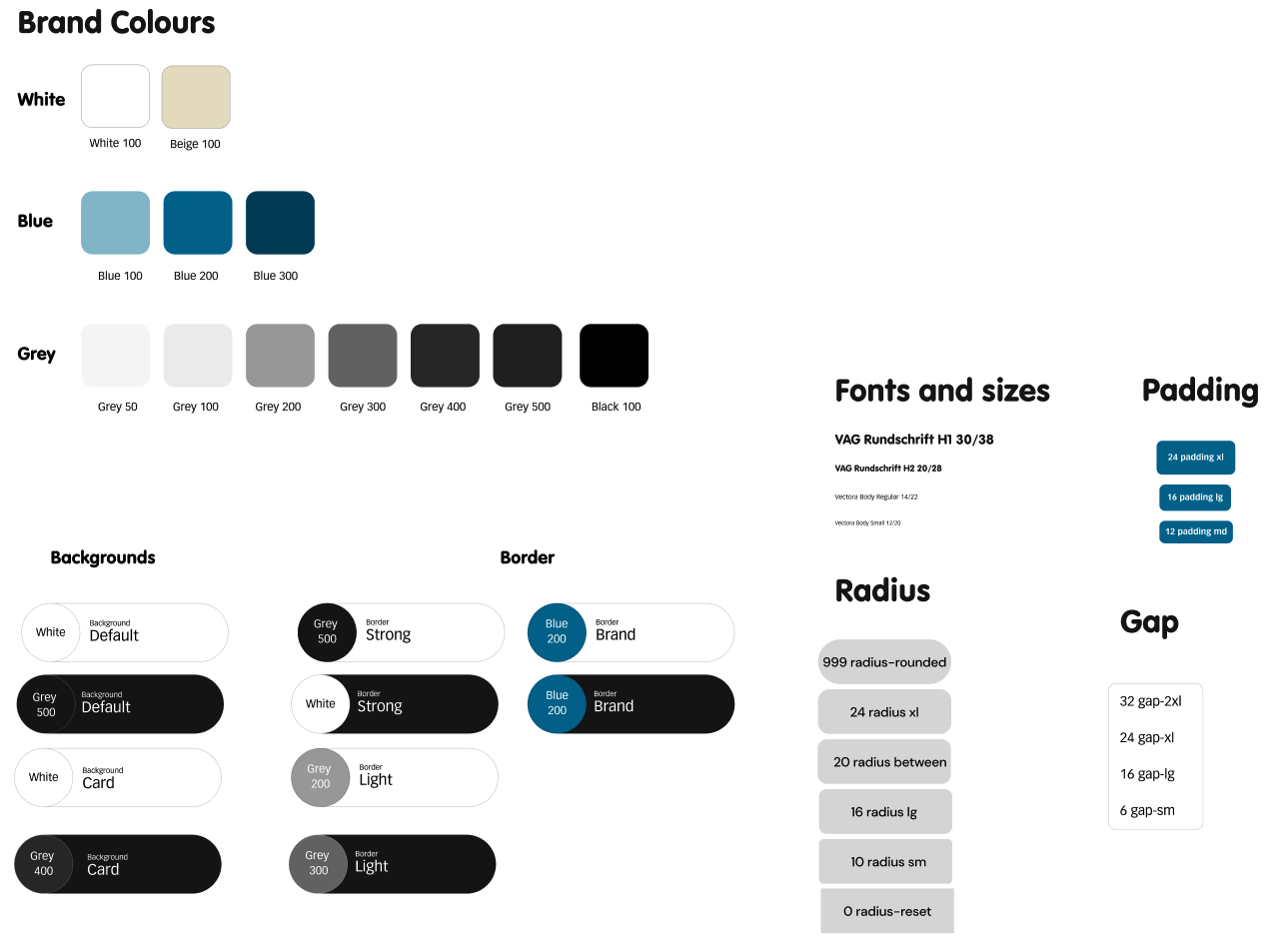
Design System
The design system encompasses the overall look for the prototype. The brand colours are black, white, grey, blue, and beige. When to use those button colours, and rules for font sizes, padding, spacing, and button radius.
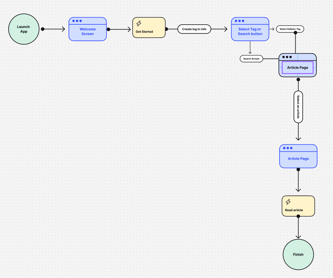
User Flow
The user flow was created as a basic template to base the prototype on. Figuring out what buttons could cause what actions and where those lead to.
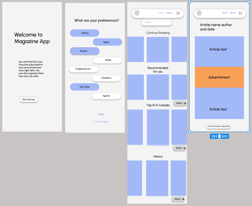
Wire Frame
Using the user flow as a starting point, a preliminary wireframe is created to organize
and figure out which pages are needed before beginning the final prototype design.
Prototype
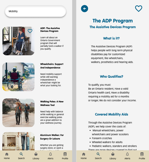
This prototype was programmed to mimic the act of someone opening the app for the first time, signing in with their email, searching
for an article, favouriting an article, and viewing favourited articles in a library. It used the brand’s design system and branding elements to create a cohesive prototype.
User feedback
The prototype was not for user testing, and asked the users to provide feedback after they tested it. The language on the first home screen needs to be slightly adjusted; instead of describing a search bar, the term should be changed to search button or widget. The prototype was programmed to go one way, but it starts to break when the users try to go backwards. When the article is accessed from the library, the search button sends the user to the search results page instead of back to the library.
Booklet Cover
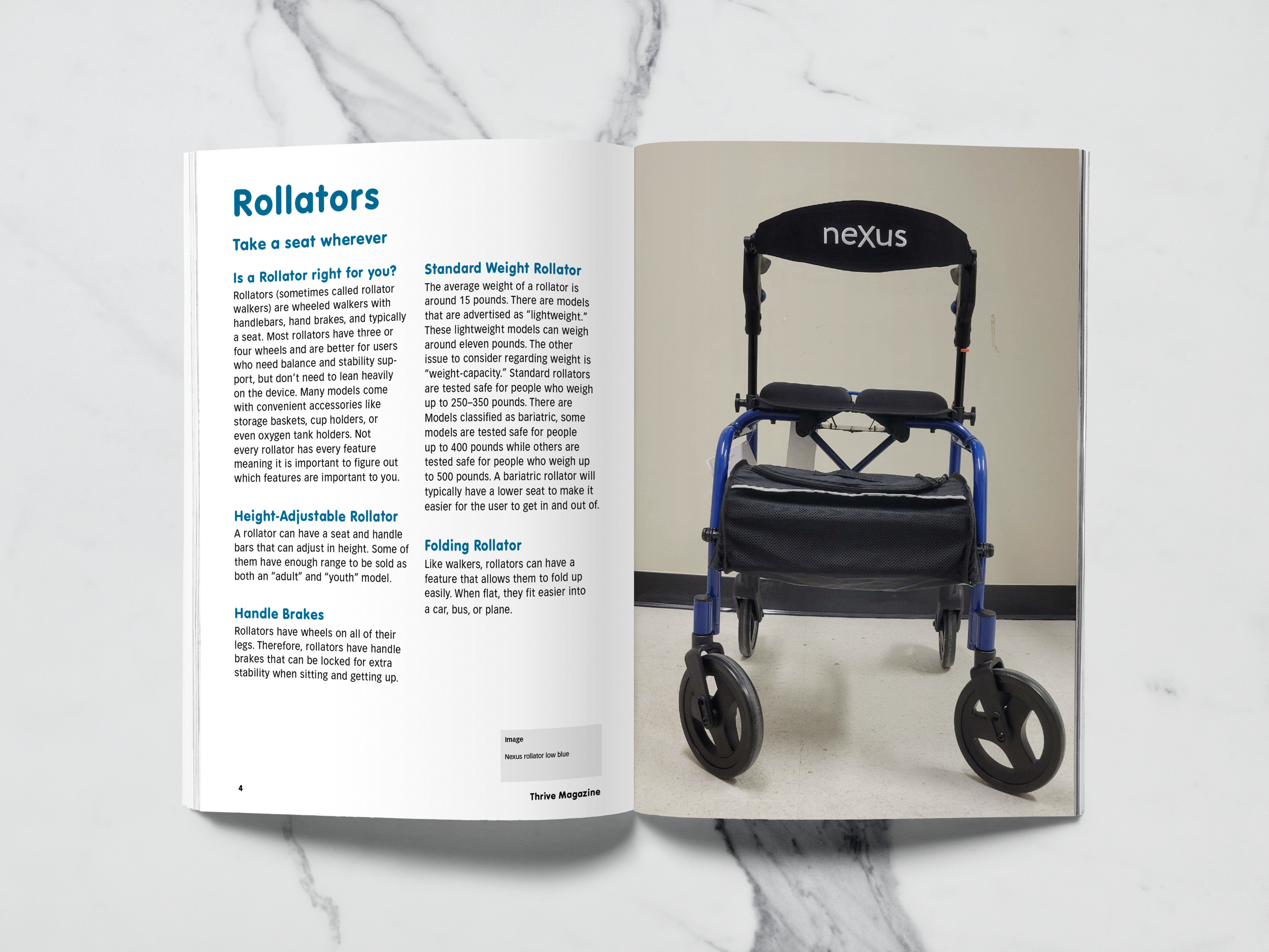
Rollators: Take A Seat Wherever
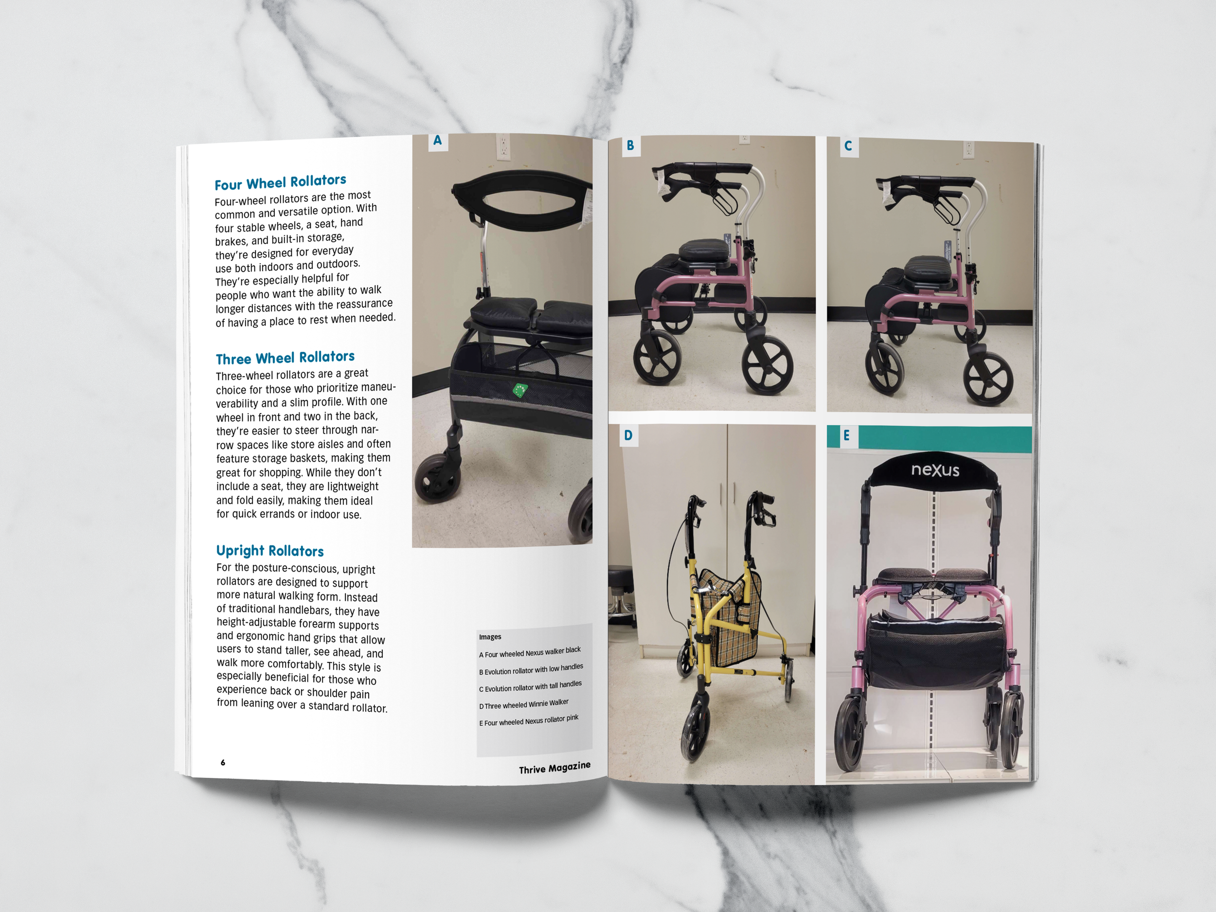
Rollator Styles
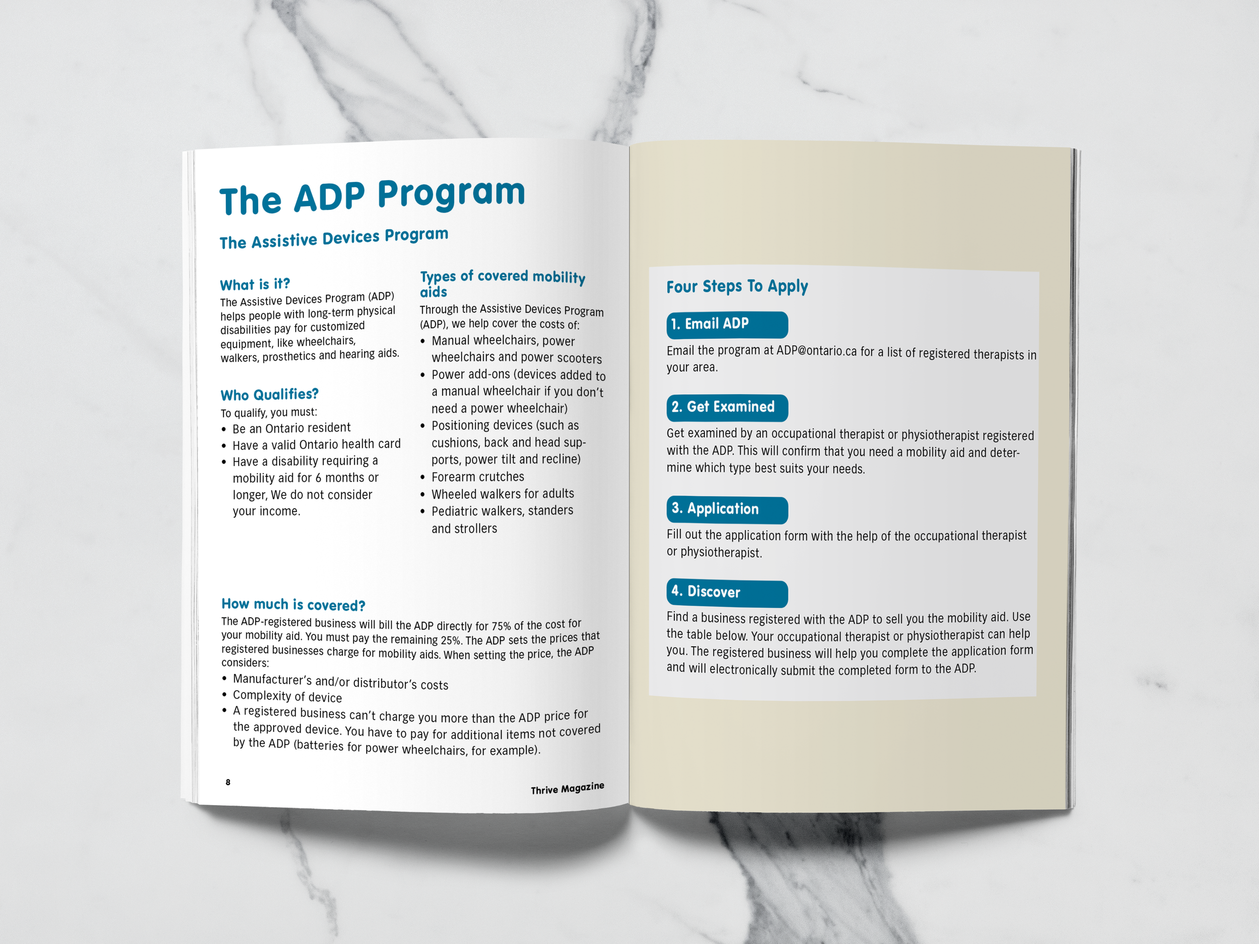
ADP: Government Funding Program
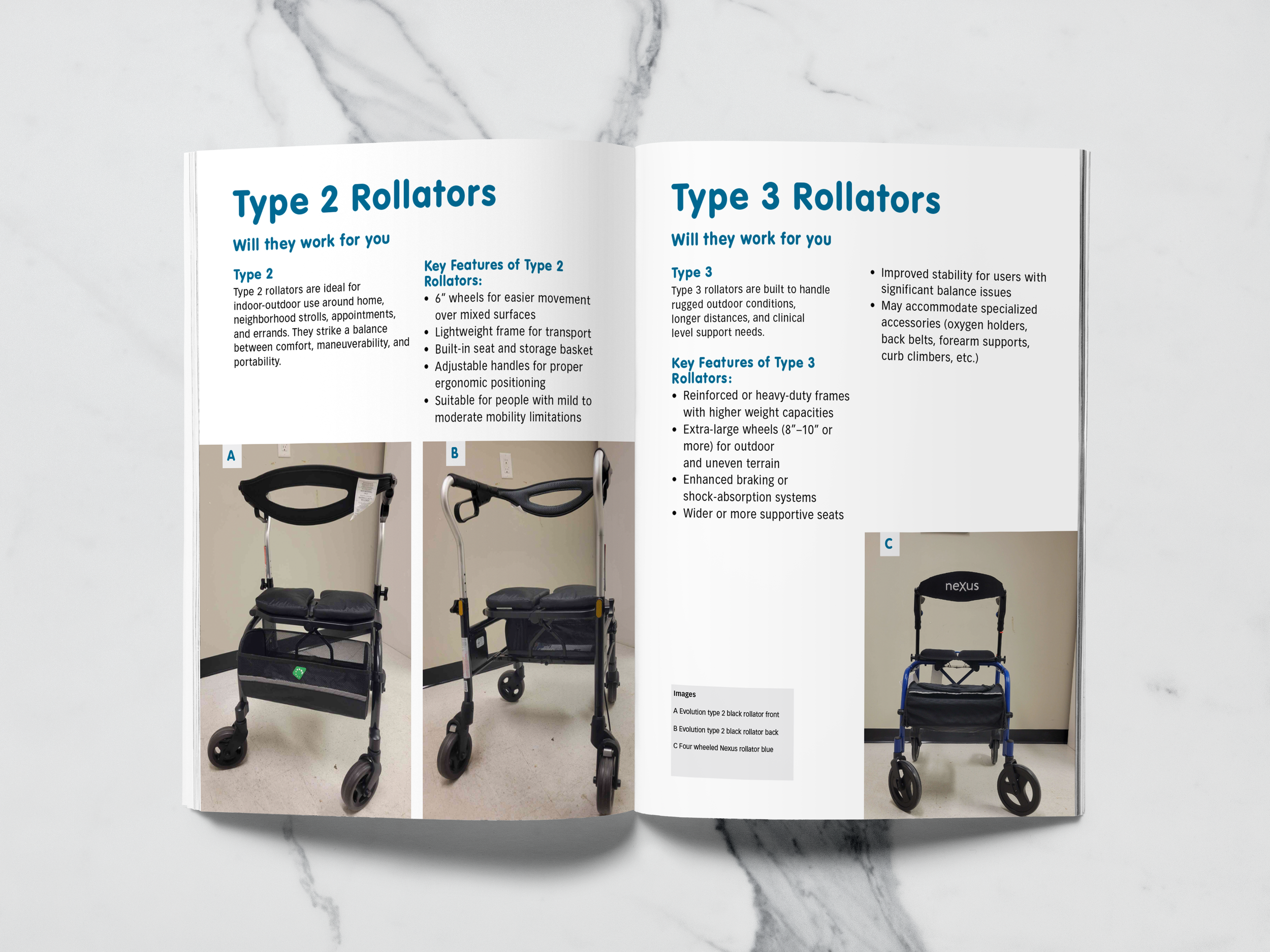
Type 2 And Type 3
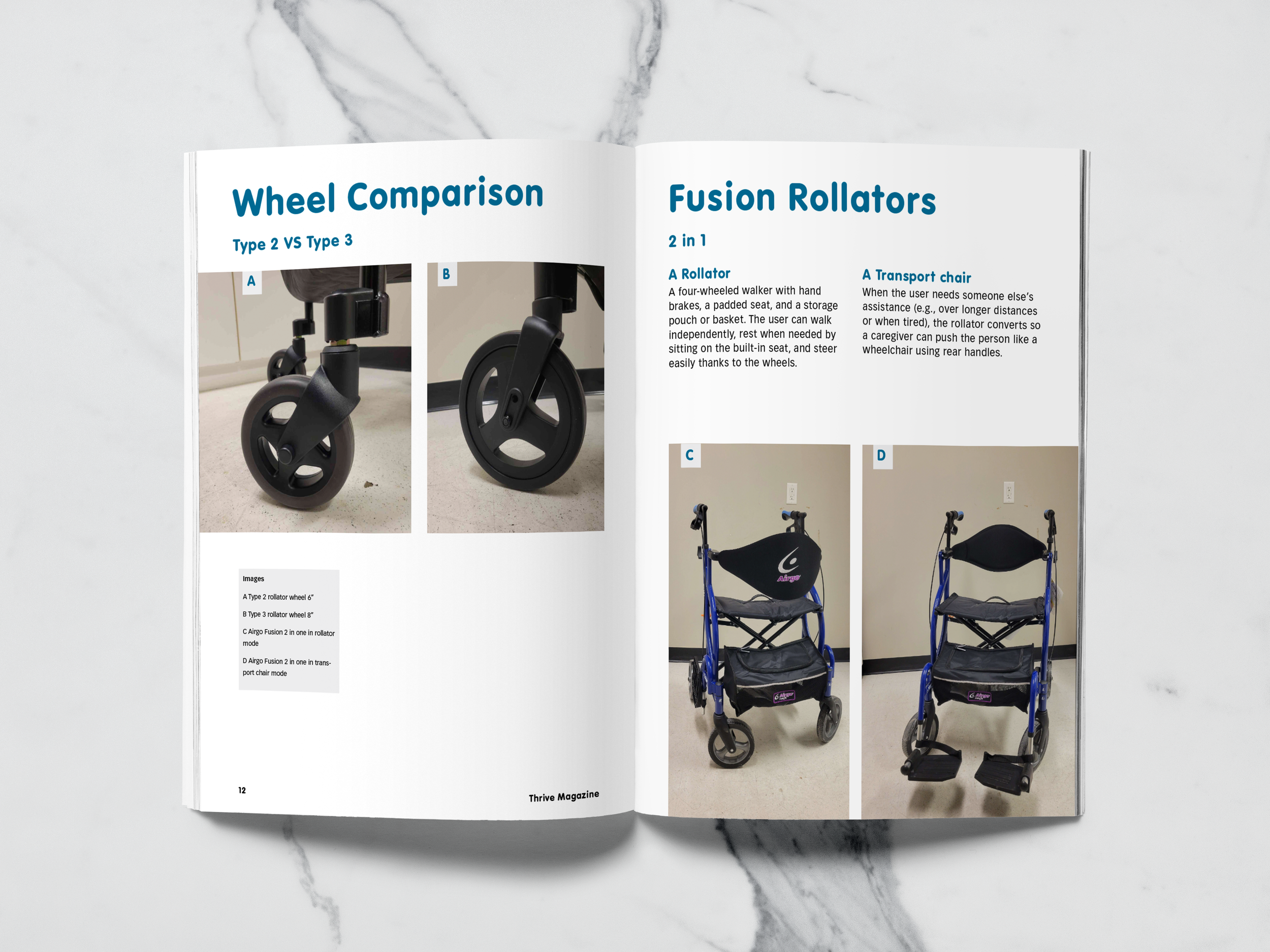
Wheel Comparison And Fusions
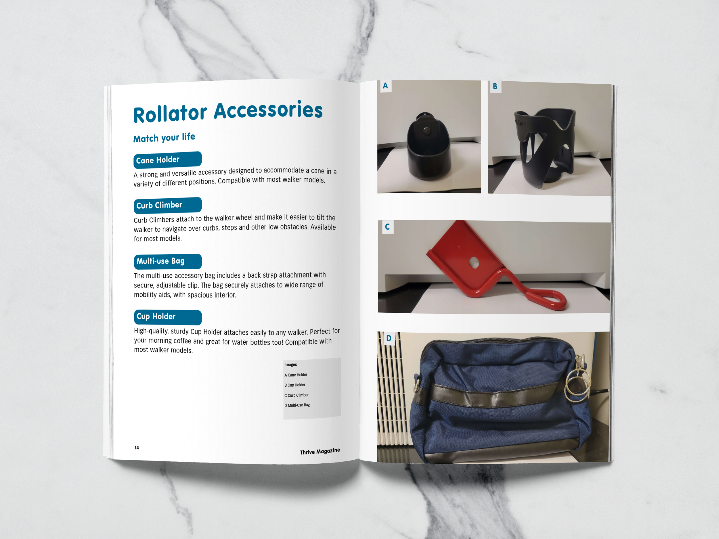
Rollator Accessories
Final Logo
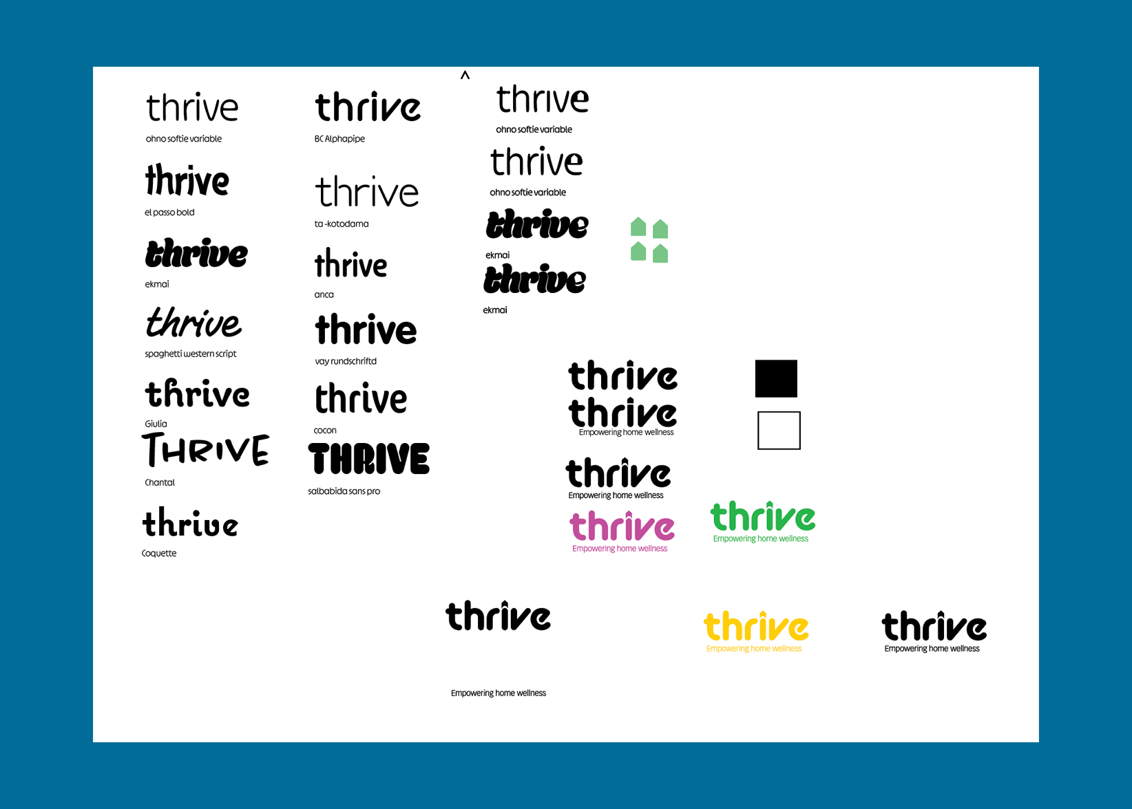
Thrive Logo Exploration
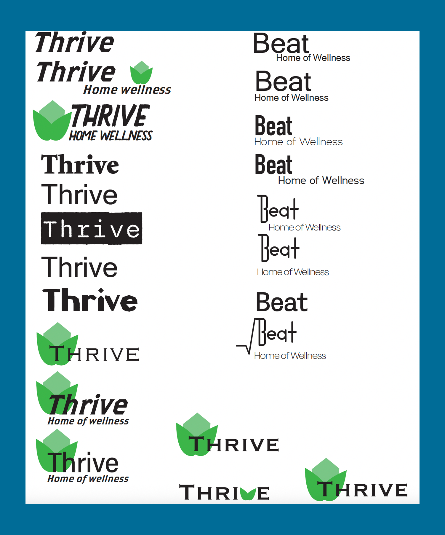
Thrive And Beat Initial Concepts
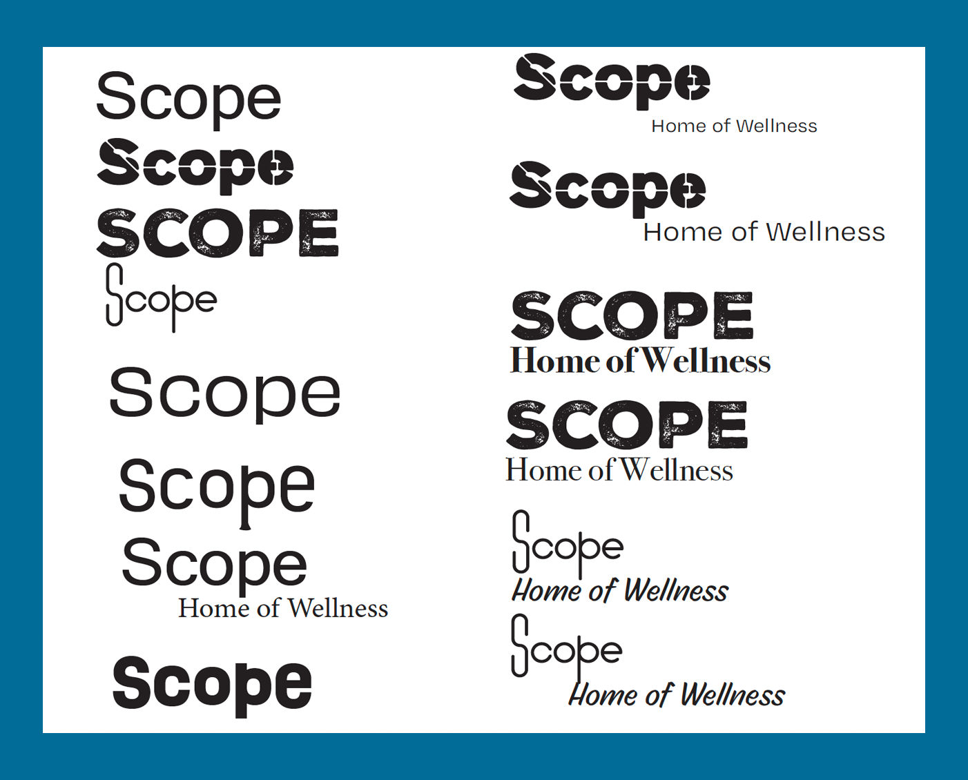
Scope Initial Concepts
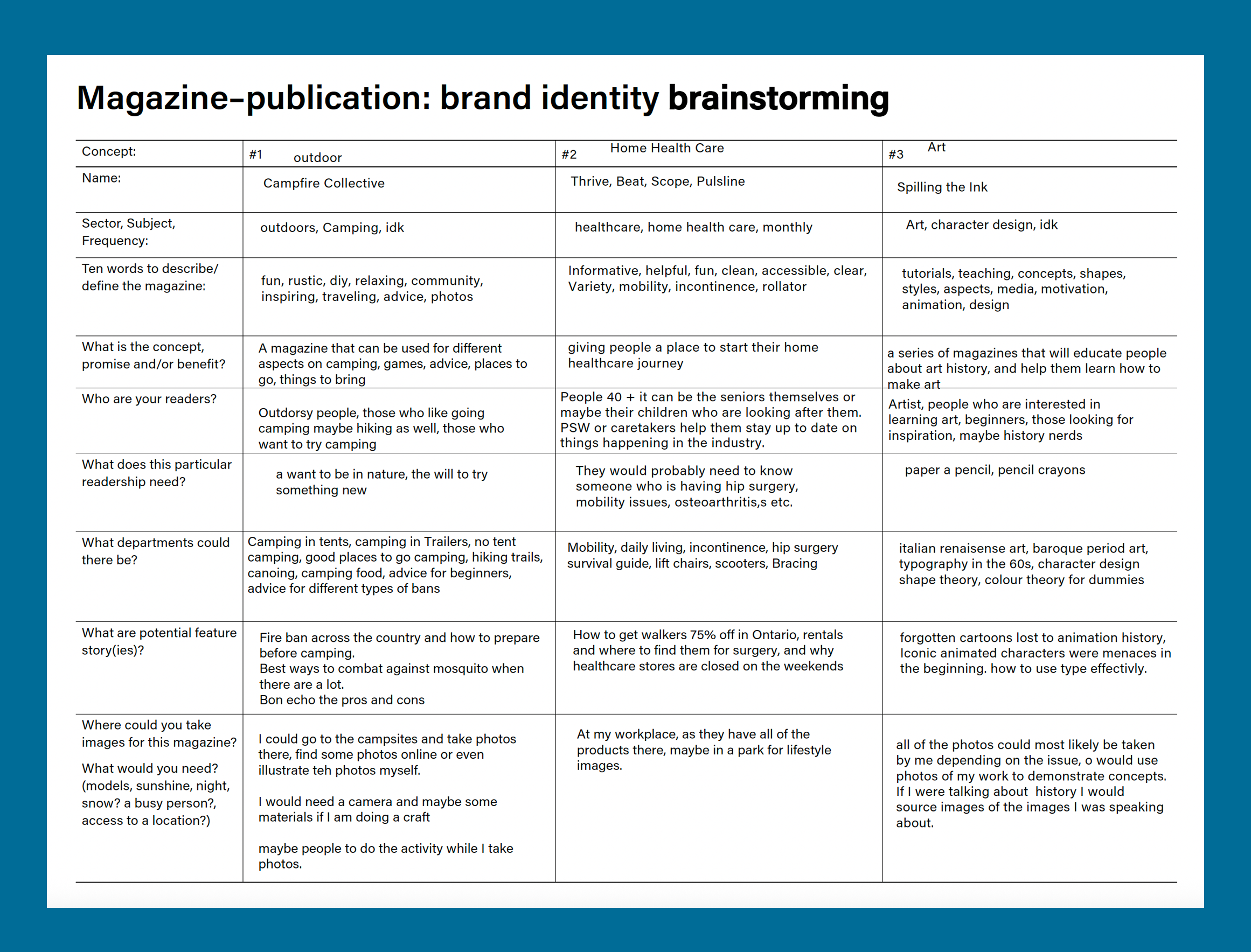
Magazine Topic Brainstorming