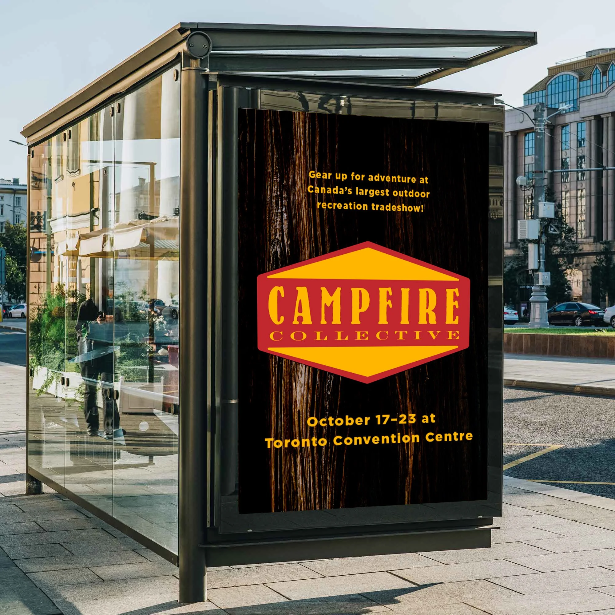
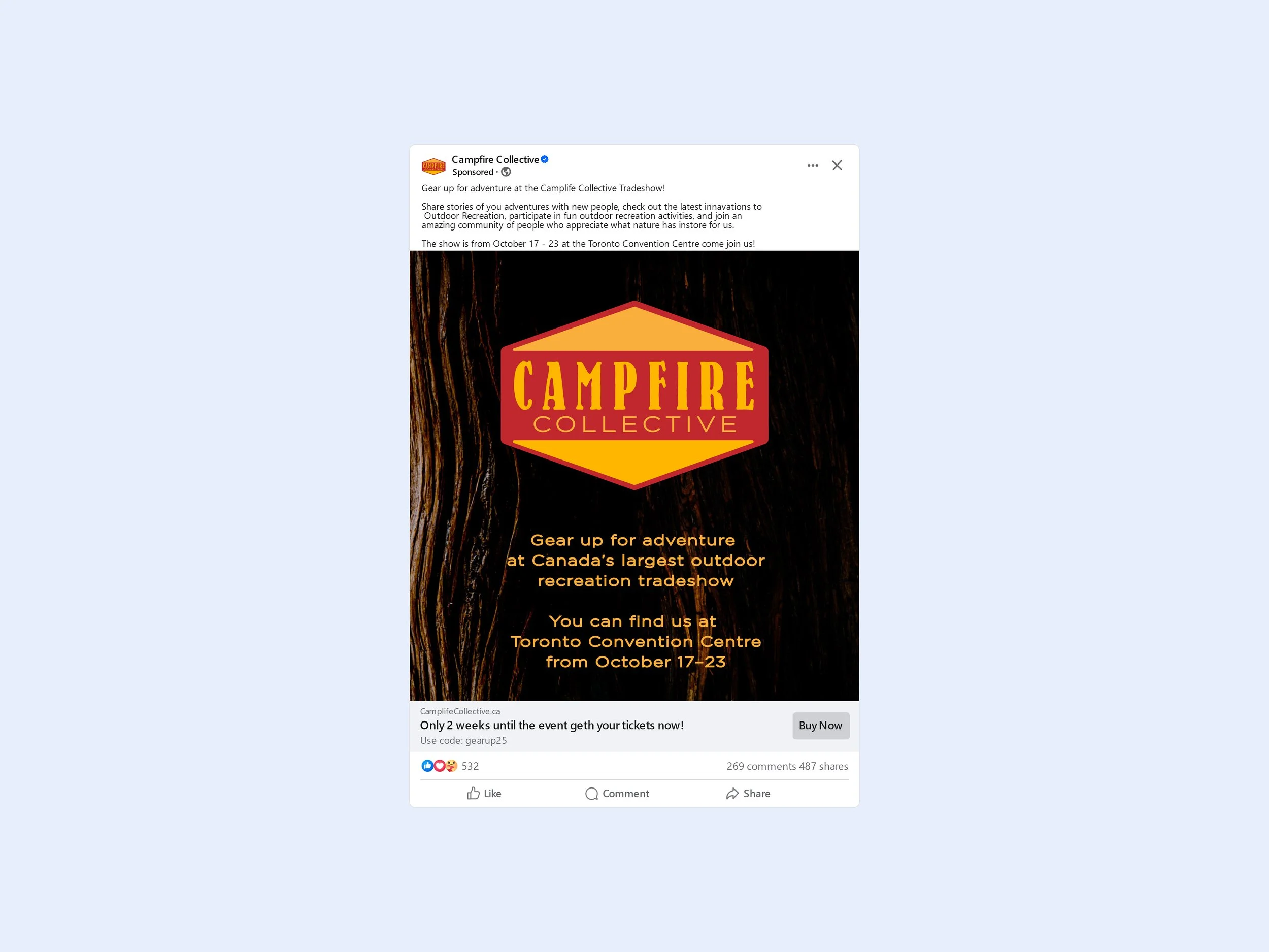
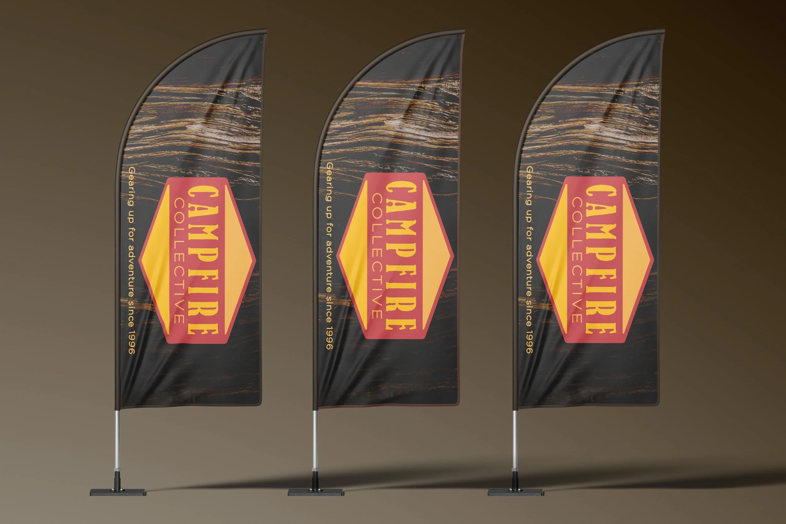
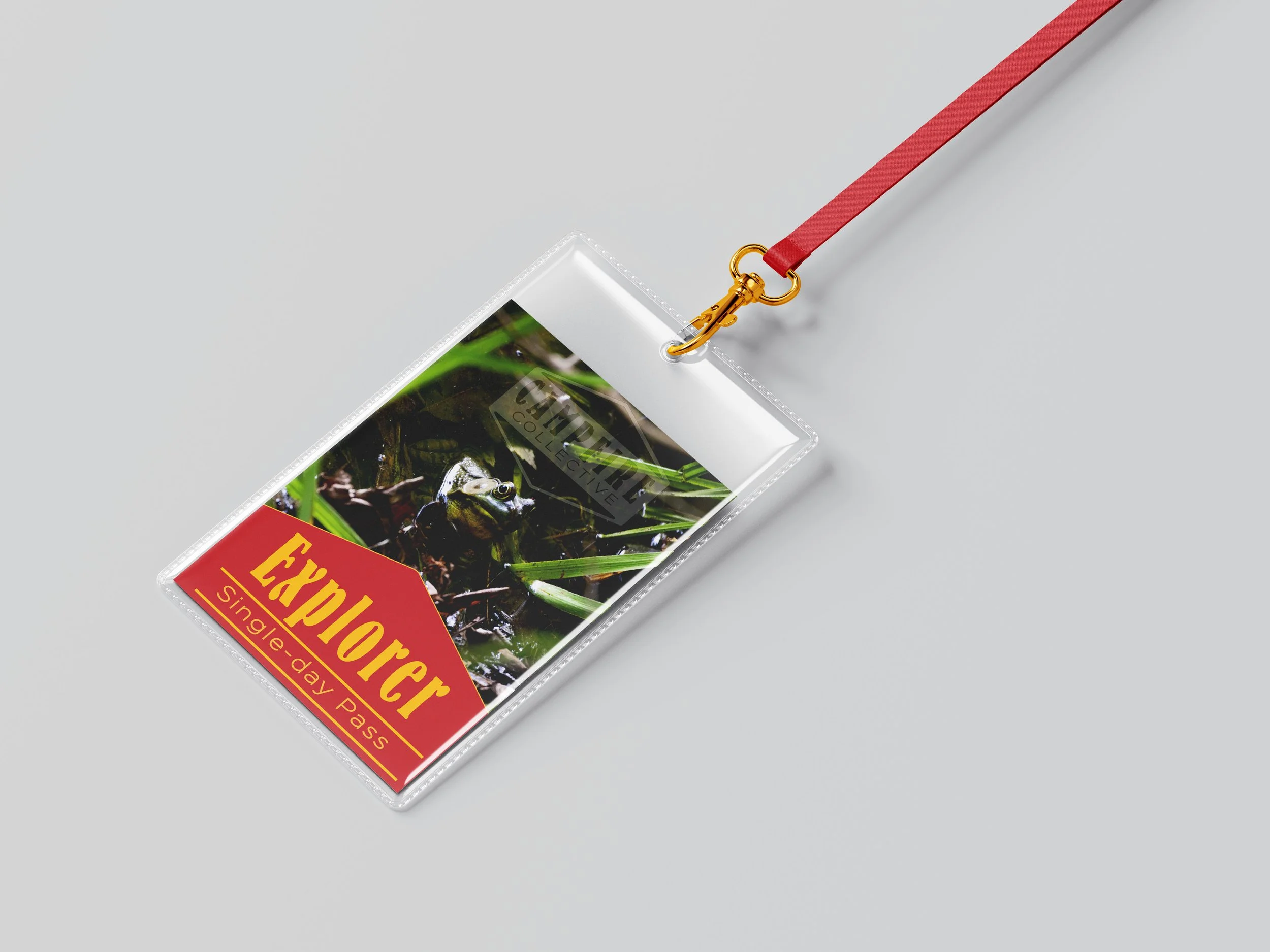
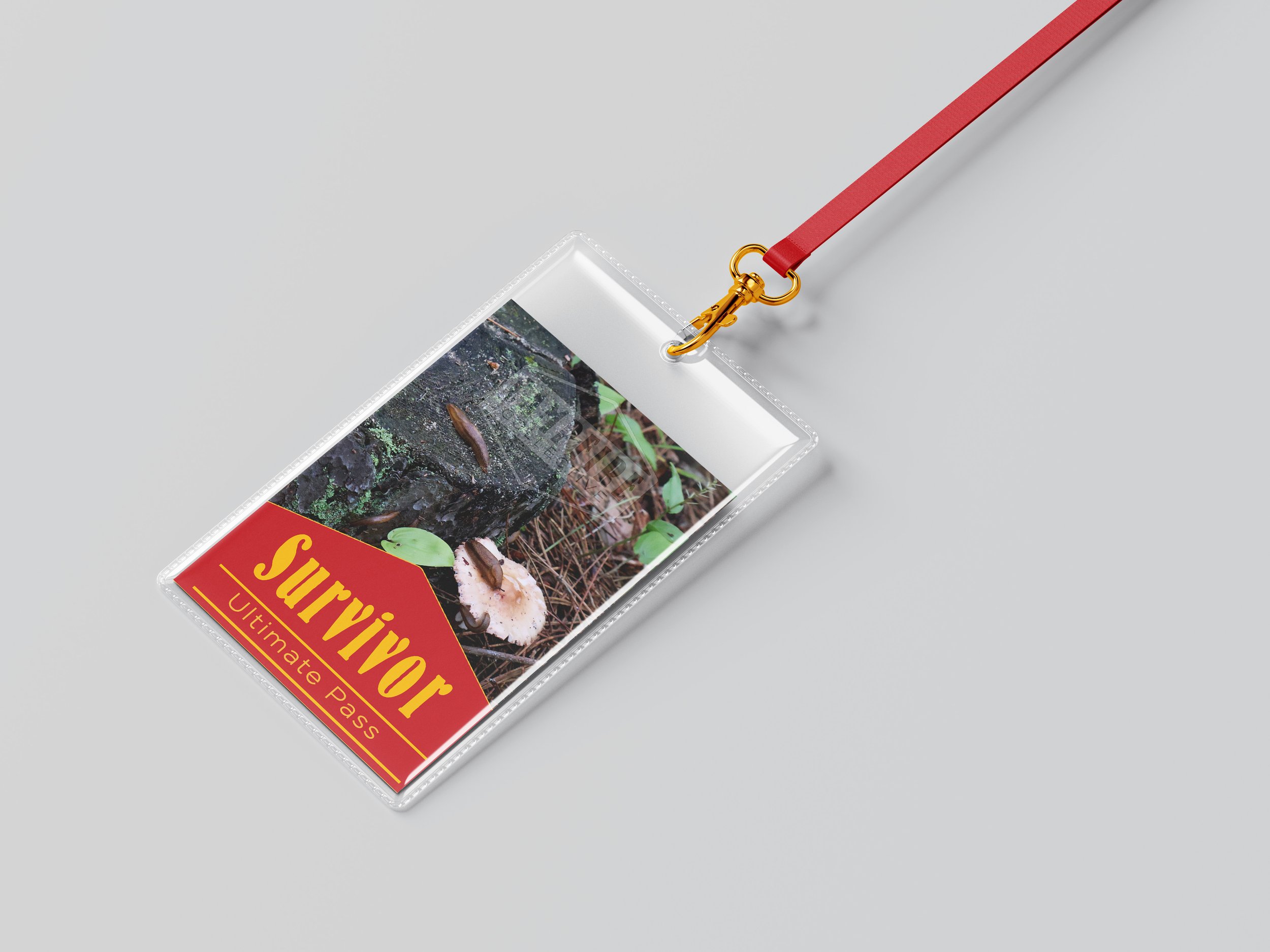
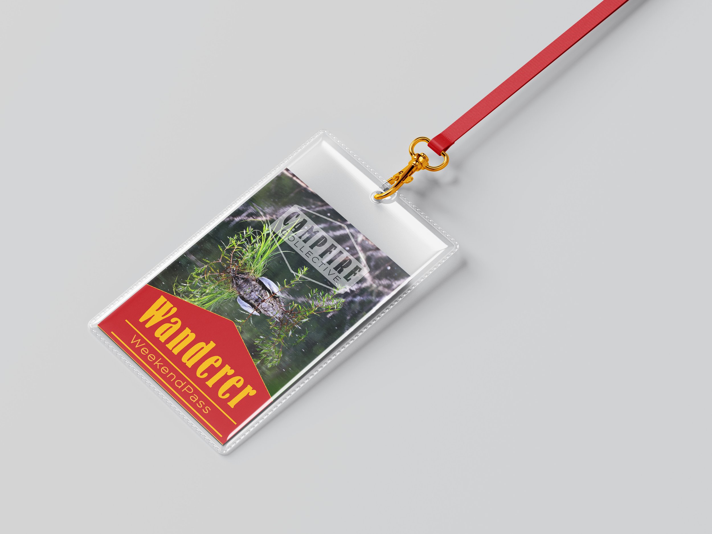
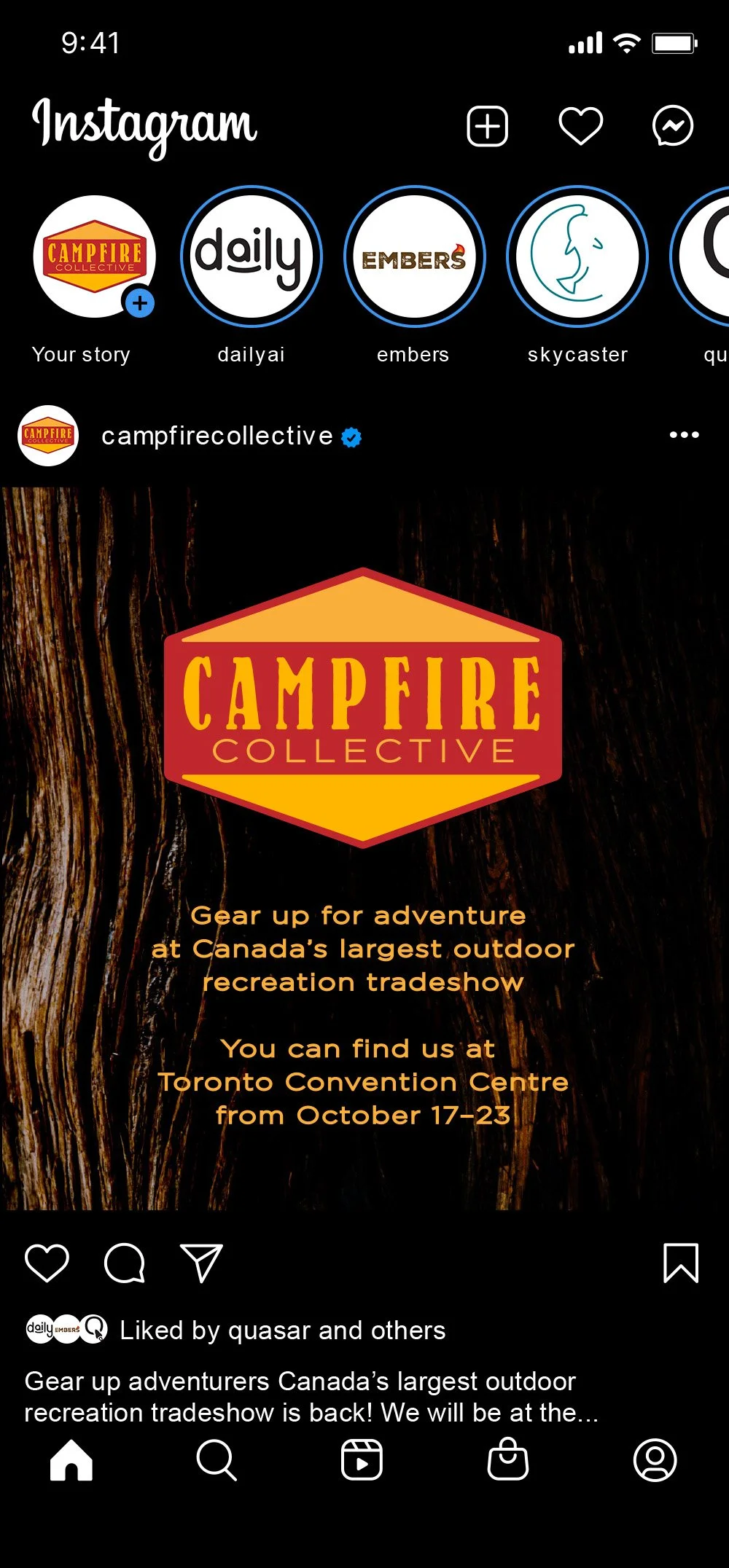
Campfire Collective
Typography, Branding, Photography
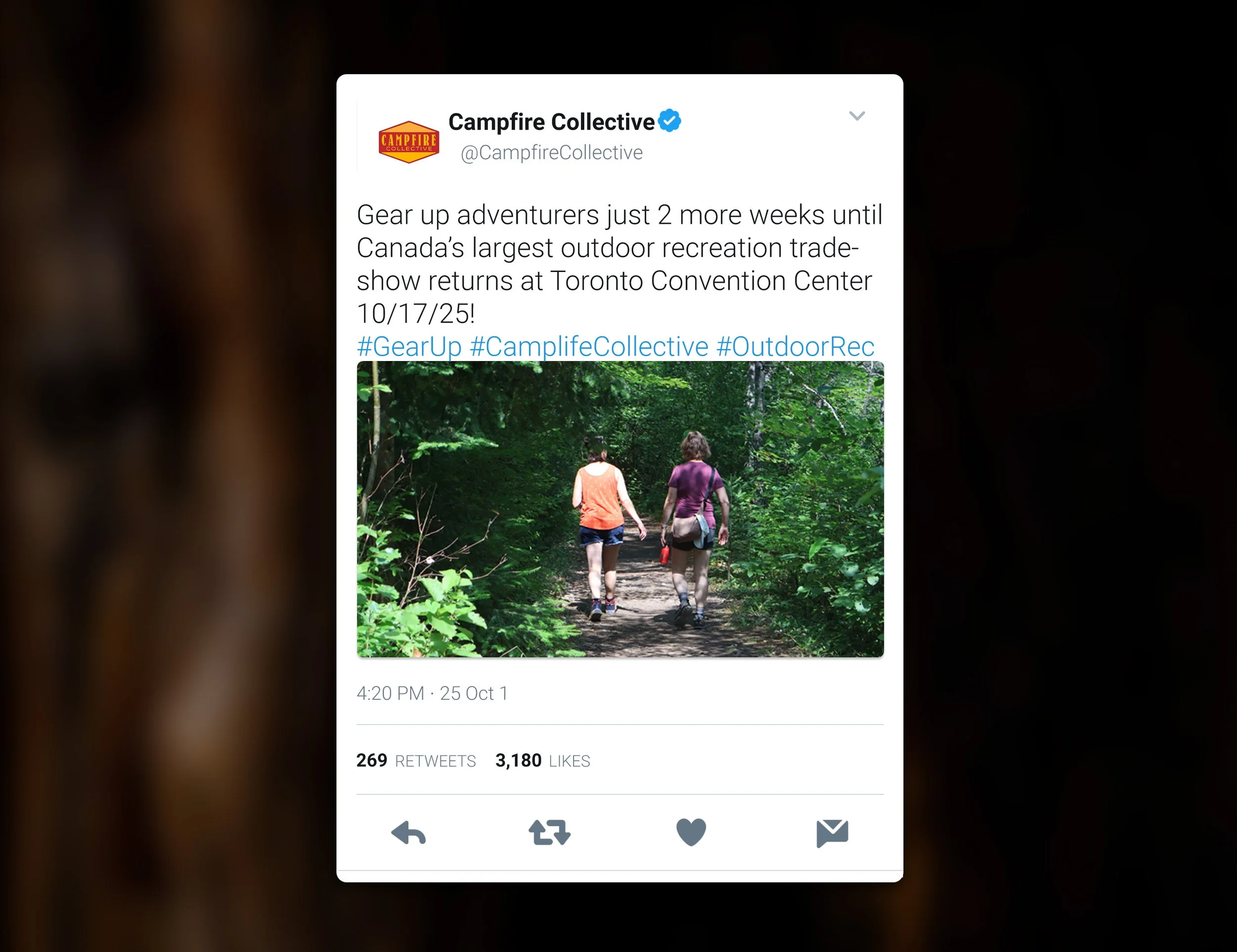
Campfire Collective is an annual week-long tradeshow that has been hosted at convention centers across Canada since
1996. Born from the spirit of the campfire
where stories are shared, gear is passed around, and plans for the next great adventure are made, Campfire Collective is where the outdoor industry comes to connect, inspire,
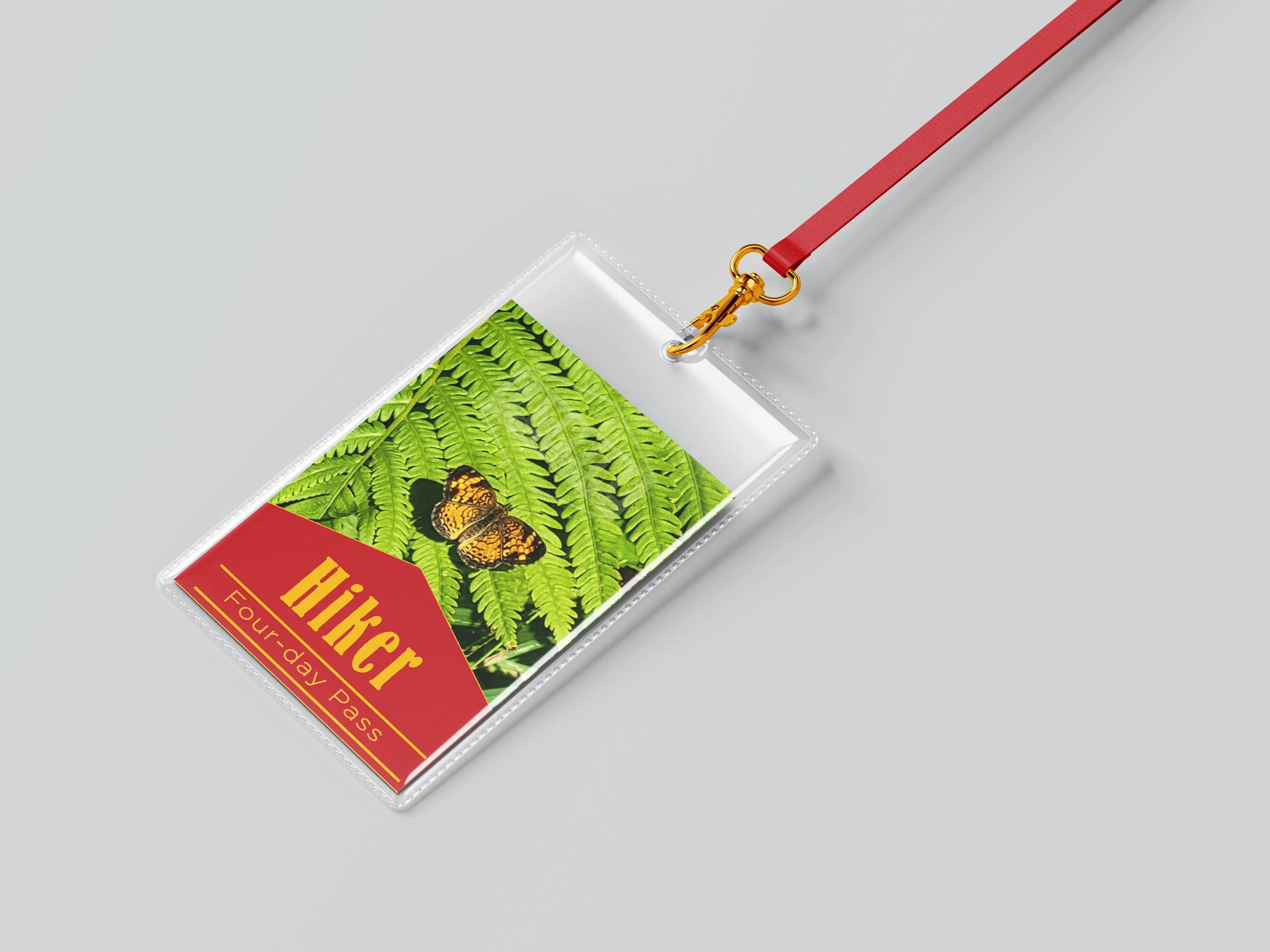
and evolve. Whether you’re a legacy brand,
a startup innovator, or a trail explorer,
this is your space to shine.